You’ve built the backend—FastAPI endpoints, MessageManager, Redis caching, streaming responses. The agent works perfectly in the terminal. Now you need a user interface. AI tools like Claude Code can generate frontend code efficiently, but understanding the structure makes you far more effective. The golden insight in this article is the mental model shift from imperative (backend) to declarative (React) programming, and understanding React’s nested, composed structure. Even experienced frontend developers struggle with this concept.
This is Part 1 of the Agent Interface series. Part 2 covers component execution, state management with hooks, data fetching, and building complete chat interfaces. You should be comfortable with JavaScript fundamentals (functions, objects, async/await), basic HTML/CSS concepts, and using the command line. No React knowledge required.
The Evolution of User Experience
User experience defines whether products succeed or fail. Each era of the web brought new interaction paradigms—and new technical challenges that demanded new architectures:
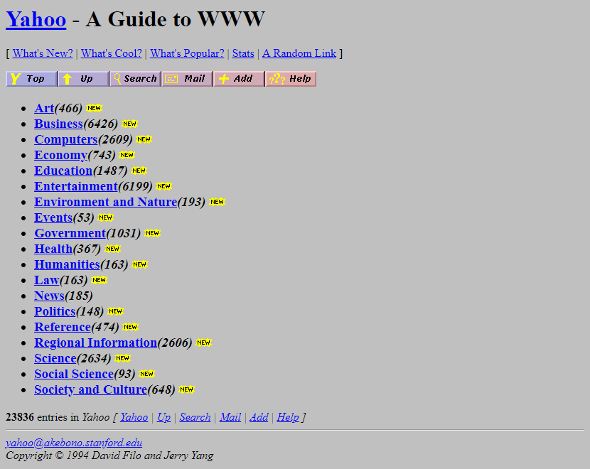
- Web 1.0 (Yahoo 1994): Documents and hyperlinks. Static pages, simple navigation.
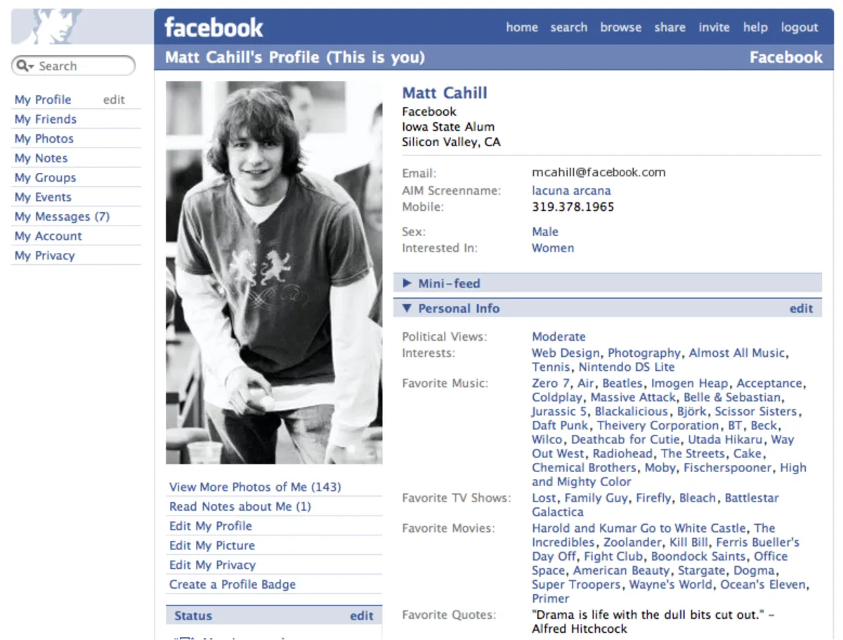
- Web 2.0 (Facebook, Instagram): Rich interactivity—likes, comments, real-time updates. Exposed MVC’s limitations with complex bidirectional data flow.
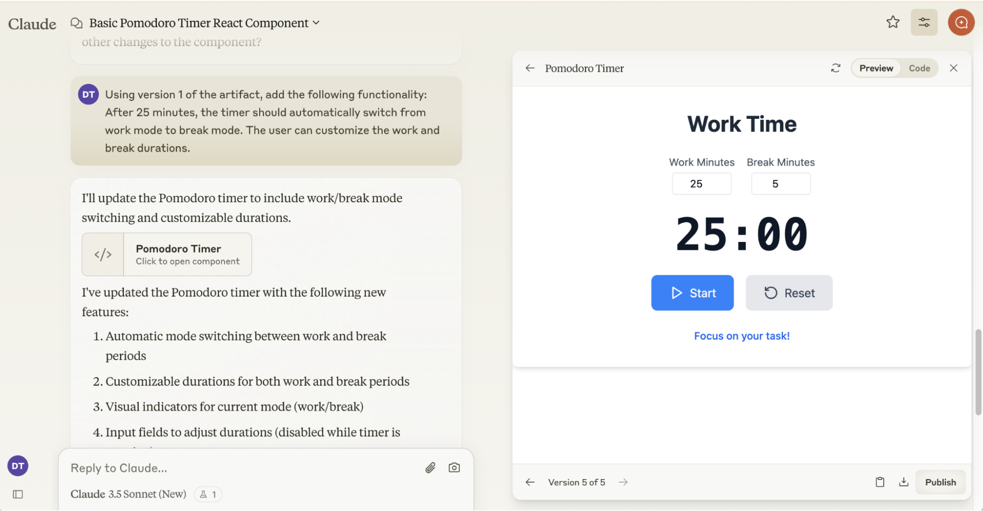
- AI Era (Claude artifacts, ChatGPT streaming): Intelligent interaction—streaming responses, tool visualization, human-in-the-loop collaboration.
React solved Web 2.0’s complexity. Agent interfaces need React’s foundation plus new patterns for AI collaboration—which is exactly what this series teaches.

React’s Mental Model: From Imperative to Declarative
In 2013, Pete Hunt gave a talk at JSConf EU titled “React: Rethinking Best Practices” that explained why Facebook created React. Despite having only 540,000 views over 12 years, it remains one of the most important explanations of React’s core philosophy. The talk reveals React’s revolutionary insight: shifting from imperative (tell the computer HOW to do something) to declarative programming (describe WHAT you want). Understanding this history reveals why React works the way it does—and why the mental model shift matters so much.
Before understanding React, we need to understand what came before: traditional Model-View-Controller architecture with server-side rendering. This pattern dominated web development in the 2000s and worked well—until user expectations changed.
Server-Side Rendering: User action → HTTP request → Server updates database → Server generates NEW HTML → Browser refreshes entire page.
Why this was good (2000s): Clean separation, secure business logic on server, works on any browser, perfect for document sites.
MPA vs SPA: Multi-Page Application (each click = new page from server). Single-Page Application (one page, JavaScript updates DOM, AJAX for data only).
What broke (2010s): Full refresh too slow. No real-time updates. Poor for nested interactive UI (comments → replies → likes). AJAX complexity. Facebook needed rich interactivity WITHOUT page refreshes.
This architecture worked for document-heavy sites like blogs and e-commerce. But when Facebook needed real-time updates, nested interactive UI, and instant feedback without page refreshes, MVC’s limitations became clear. The next tab shows exactly what broke…
Facebook’s MVC became unmanageable at scale. Tom Occhino explained: “MVC got really complicated really quickly”[1]. The core issue: bidirectional data flow created cascading updates.
Click “Start Demo” to see how one button click triggers a chain reaction. Watch the numbered indicators (①②③④⑤) as each component updates:
The Debugging Nightmare
In production, this cascade continues through analytics, user activity tracking, feed reordering, and more. When a bug occurs—like a notification count showing the wrong number—which of the 20+ code paths caused it? With bidirectional flow, data can change from anywhere and affect anything.
Pete Hunt realized: “The most important thing we wanted was just to have reproducible bugs”[2]. React’s solution: unidirectional data flow that makes cause and effect predictable.
React introduced a revolutionary data flow pattern that solved MVC’s cascade problem: unidirectional data flow. Instead of data changing from anywhere and affecting anything, React enforces a simple rule: state flows down through props, events flow up through callbacks. This makes every update predictable and traceable—the exact opposite of MVC’s bidirectional chaos.
Pete Hunt’s insight: “React components are basically just idempotent functions”[2]—they describe UI based on inputs (props + state), nothing more. When state changes, React re-renders the component tree, diffs what changed, and updates only what’s necessary. No observers. No cascades. Just pure functions describing UI.
The fundamental shift in React isn’t just about components or data flow—it’s about how you think. Traditional programming is imperative: tell the computer HOW to do something, step-by-step. React is declarative: describe WHAT you want the UI to look like, and React figures out HOW to make it happen.
Imperative (Traditional)
Thinking: Tell computer HOW
// Imperative: Step-by-step DOM mutations

const badge = document.querySelector('#badge')
const count = getCount()

if (count > 0) {
  badge.style.display = 'block'
  badge.textContent = count
} else {
  badge.style.display = 'none'
}

// When data changes, must manually:
// - Find element again
// - Update each property
// - Track dependencies yourself

// Hard to visualize final state
After 10 updates, what does the UI look like? Hard to know without running the code.
Declarative (React)
Thinking: Describe WHAT you want. React figures out HOW.
<App> Component
ParentState: const [count, setCount] = useState(3)
Role: Single source of truth - state lives here
return <Sidebar count={count} onMarkRead={handleMarkRead} />
↓ Props flow DOWN: count={3}, onMarkRead={function}
The Mental Model Shift:
Imperative: "Hide this, show that, update this..." (HOW - step-by-step mutations)
Declarative: "If count > 0, show badge. Else hide it." (WHAT - describe desired state)
Your code structure (nested components) mirrors your UI structure (nested elements). This is the revolution.
This is why React feels revolutionary. Your code looks like a snapshot of the UI, not a series of mutations. Pete Hunt called this “shortening the conceptual gap between the static program and the dynamic process.” The nested component structure (App → Sidebar → Button) mirrors the nested UI structure—making it dramatically easier to reason about what your application does.
Building with the Ecosystem: Composition Over Creation
You understand the React mental model. Now you need practical skills: project setup, finding reusable components, and integrating design systems. Modern frontend development emphasizes composition over creation—the ecosystem provides battle-tested primitives you adapt rather than building from scratch.
A typical React + Vite frontend project has a predictable structure. Understanding this layout helps you navigate any modern frontend codebase. The detailed code is in the repository—here we focus on understanding the purpose of each piece.
Project Structure
Key Configuration Files
vite.config.ts Build Tool
What is Vite? A modern build tool that replaces Webpack. Think of it like a fast development server + production bundler combined.
What does "bundle" mean? Combining your hundreds of small files (components, CSS, images) into a few optimized files the browser can load quickly.
Key responsibilities:
- Dev server: Hot reload - save file, see changes instantly
- Path aliases:
@/components/Buttoninstead of../../../components/Button - Plugins: React JSX transformation, TypeScript compilation
- Build optimization: Code splitting, minification, tree shaking
tsconfig.json TypeScript
Why TypeScript? Catches bugs at compile time instead of runtime. Like Python type hints + mypy, but mandatory in frontend.
What does strict mode catch?
- Null safety:
user.nameerrors ifusermight be null - Type mismatches: Can't pass string to function expecting number
- Missing properties: IDE autocomplete shows available fields
- JSX support: Transforms
<Button />to React code
Path mappings: "@/*": ["./src/*"] enables absolute imports
tailwind.config.js Design System
What: Extends Tailwind with your design tokens (colors, spacing, typography)
Key sections:
- content: Which files to scan for Tailwind classes (enables tree-shaking)
- theme.extend.colors: Maps CSS variables to utilities (
bg-primary→var(--primary)) - fontFamily: Custom fonts (IBM Plex Sans, Satoshi)
Why: Single source of truth - change --primary variable, entire UI updates
package.json Dependencies
Frontend's requirements.txt. But with more structure:
- dependencies: Production code (React, Tailwind, shadcn). Shipped to users.
- devDependencies: Build tools (Vite, TypeScript, PostCSS). Not in final bundle.
- scripts: npm commands -
npm run dev,npm run build
Agent UI essentials: React (framework), Tailwind (styling), shadcn/ui (components), TypeScript (types)
Unlike backend where libraries are heavy (ML models, ORMs), frontend dependencies are mostly tiny utilities.
This setup mirrors a FastAPI project: package.json is like pyproject.toml, main.tsx is your entry point, config files define how the project builds. Key difference: frontend builds generate static files browsers execute directly, backend code runs on a server.
You don’t build components from scratch. Modern frontend combines three tools: Tailwind (styling utilities), CVA (variant management), and shadcn/ui (component templates). This tab shows how they work together.
shadcn/ui’s copy-paste approach might seem unconventional—but as Hayden Bleasel explains[3], it solves a fundamental problem: traditional libraries force you into “override culture,” fighting predetermined structures. shadcn/ui gives you source code ownership while maintaining semantic design tokens for consistency.
- Tailwind CSS
Provides utility classes that map to CSS properties.
px-4= padding-left/right: 1rem,bg-primary= background from your design tokens. Compose utilities to build any design without writing CSS. - CVA (Class Variance Authority)
Prevents messy conditionals. Instead of
className={size === 'lg' ? 'px-8 text-lg' : 'px-4 text-sm'}, define variants once:buttonVariants({ size: { lg: "px-8 text-lg", sm: "px-4 text-sm" } }). Cleaner, reusable, type-safe. - shadcn/ui
Your starting point. Run
npx shadcn add buttonto copy the Button code (shown on right) into your project. It already uses CVA + Tailwind. You customize it—add new variants, change colors, adjust spacing.
The workflow: Copy shadcn's Button template → Already set up with CVA structure → Add your variants using Tailwind classes → Use it: <Button size="lg" variant="primary" />
Interactive Demo
Change the controls below to see how variants work
// Button.tsx with CVA
import { cva } from "class-variance-authority"

const buttonVariants = cva(
  "inline-flex items-center rounded-md font-medium",
  {
    variants: {
      size: {
        sm: "h-9 px-3 text-sm",
        md: "h-10 px-4 text-base",
        lg: "h-11 px-8 text-lg"
      },
      variant: {
        primary: "bg-primary text-white hover:bg-primary/90",
        secondary: "bg-gray-200 text-gray-900 hover:bg-gray-300",
        outline: "border border-gray-300 bg-white hover:bg-gray-100"
      }
    }
  }
)

// This code comes from shadcn/ui - copy and customize freely
Design System in Practice
You’ve seen the setup—design tokens, Tailwind config, shadcn/ui. Now let’s build. This section shows practical patterns: Tailwind utilities for layout, design tokens for consistency, and composing components. We built a complete chat interface to learn these patterns. Theory becomes practice, line by line.
Design tokens are the foundation of any scalable design system. They’re named values—colors, spacing, typography—that you define once in TypeScript, map to CSS variables, and use everywhere in your components. This three-layer approach gives you consistency (no more magic numbers), themability (dark mode with zero component changes), and maintainability (change palette.orange[500] once, update the entire app). Without tokens, you’re hardcoding #EA5804 in 50 places and manually updating each one when the brand color changes. With tokens, you change one value and the design system propagates it automatically.
Design Tokens
Design tokens are your visual design decisions—colors, spacing, typography—defined once and used everywhere.
// TypeScript
palette.orange[500]
/* CSS Variables */
--primary: #EA5804
/* Usage in Components */
className="bg-primary"
Why Tokens?
Colors
Brand orange palette with 9-step scale
Spacing
4px base unit scale for consistent layouts
Typography
Font size hierarchy with consistent line heights
In Action
Hover over elements to see which tokens they use
Before using design tokens, you need CSS fundamentals. This tab explains how CSS classes, variables, and the cascade work—the foundation that makes the entire token system possible. Understanding this unlocks why changing one CSS variable can re-theme your entire application instantly.
CSS Quick Start
CSS is the foundation that makes design tokens work. These concepts are all you need to understand how tokens flow from TypeScript to your components—and why changing one CSS variable can re-theme your entire application instantly.
Key Concepts
CSS Classes Foundation
What are classes? Selectors that apply styles to HTML elements.
/* CSS */
.bg-primary {
  background: #EA5804;
}

/* HTML */
<button class="bg-primary">Click</button>
The browser matches class="bg-primary" against CSS rules and applies the styles. Tailwind generates thousands of utility classes like this.
CSS Variables Core Mechanism
What are CSS variables? Runtime values that cascade down the DOM tree. Define once, use everywhere.
/* Define at root */
:root {
  --primary: #EA5804;
}

/* Use anywhere */
.button {
  background: var(--primary);
}
Dark mode magic: Change the variable value, every element using var(--primary) updates instantly—no component changes needed.
.dark {
  --primary: #F97316; /* Different color in dark mode */
}
Box Model Layout
Every element is a box: content + padding (inside space) + border + margin (outside space).
/* Tailwind utilities map to box model */
p-4   /* padding: 1rem (all sides) */
px-4  /* padding-left and padding-right: 1rem */
m-2   /* margin: 0.5rem */
border /* border: 1px solid */
Understanding this prevents layout bugs. Padding pushes content inward, margin pushes elements apart.
Token Flow: Build Time → Runtime Complete Picture
The complete dependency chain from tokens to styled components:
// src/tokens/colors.ts
export const palette = {
  orange: { 500: '#EA5804' }
}
Build Time // src/index.css
:root {
--primary: #EA5804;
} Build Time // tailwind.config.js
colors: { primary: 'var(--primary)' }
// Tailwind generates:
.bg-primary { background: var(--primary); } Build Time // Button.tsx <button className="bg-primary"> Click Me </button>Runtime (Browser)
Why this works: Steps 1-3 happen when you build (tokens become CSS). Step 4 happens in the browser (CSS variables are read and applied). Change a CSS variable → entire UI updates without rebuilding.
Why This Architecture? Benefits
This multi-layer approach gives you three powerful capabilities:
- Build Time (Steps 1-3): Tokens → CSS variables → Tailwind utilities. Happens once when you build.
- Runtime (Step 4): Browser reads CSS variables, applies styles. Change variable → entire UI updates without rebuild.
- Dark Mode: Just toggle
.darkclass on<html>→ All CSS variables update → All components re-theme instantly.
You’ve learned React’s revolutionary mental model—the shift from imperative to declarative programming that makes UI development tractable at scale. You understand how modern tools compose together: Tailwind provides utilities, CVA organizes variants, shadcn/ui gives you templates. You’ve seen how design tokens flow from TypeScript through CSS variables to your components, enabling consistent theming with zero component changes. This foundation prepares you to build production agent interfaces.
But understanding philosophy and tooling doesn’t mean you can build yet. Part 2 covers what comes next: component execution model, state management with hooks, API integration, and the actual patterns for building chat interfaces with streaming responses. For now, start experimenting—set up a project, copy a shadcn component, define some variants. The mental model will click when you write code, not just read about it. Theory becomes practice, line by line.
References
[1] Occhino, T. (2014). Hacker Way: Rethinking Web App Development at Facebook. Facebook F8 2014. Retrieved from https://www.youtube.com/watch?v=nYkdrAPrdcw
[2] Hunt, P. (2013). React: Rethinking Best Practices. JSConf EU 2013. Retrieved from https://www.youtube.com/watch?v=x7cQ3mrcKaY
[3] Bleasel, H. (2024). Why shadcn/ui is Taking Over. Retrieved from https://www.haydenbleasel.com/blog/shadcn. This blog articulates the “override culture” problem in traditional component libraries that the author experienced firsthand. During development of this article’s agent interface, the author initially chose Radix Themes for its utility-class power, but encountered insurmountable customization barriers—unable to remove TextArea borders or style disabled button colors. The framework fought basic styling requirements. Switching to shadcn/ui provided complete source code control, enabling custom textarea styling (className="w-full px-4 py-3 text-[18px] focus:outline-none") without wrestling predetermined structures. This migration, documented in session 2025-11-11, validated Bleasel’s thesis: at production scale, component ownership matters more than convenience.